The no-code chart types (Single, Distribution, Time-based, Cohort, Leaderboard, Objective) cover most needs. When you want full control over how data is displayed, custom visualizations, external libraries, complex layouts, use Smart Charts. With Smart Charts you write the data source on the back-end and the rendering component in the UI editor. There’s no limit to what you can render: D3.js, custom SVG, embedded iframes, anything you can write in JavaScript.

Creating a Smart Chart

From any dashboard or record analytics tab, click Edit Smart Chart to open the editor.
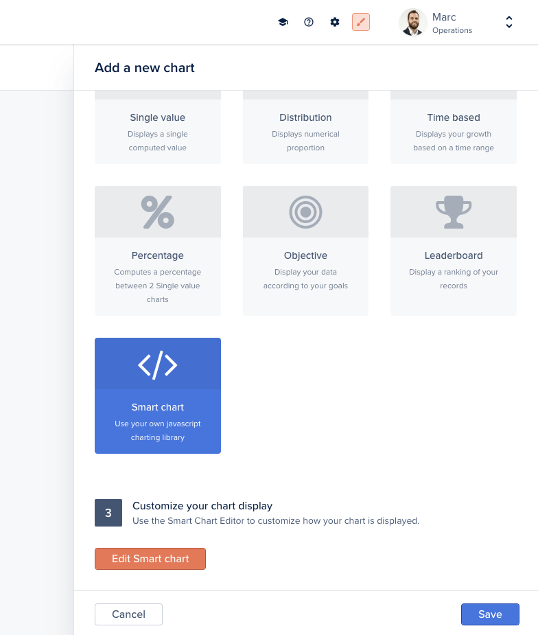
Edit Smart Chart button
The editor exposes three tabs:
  • Template, the Handlebars template that renders your chart
  • Component, the JavaScript component that loads data and orchestrates rendering
  • Style, optional CSS scoped to this chart
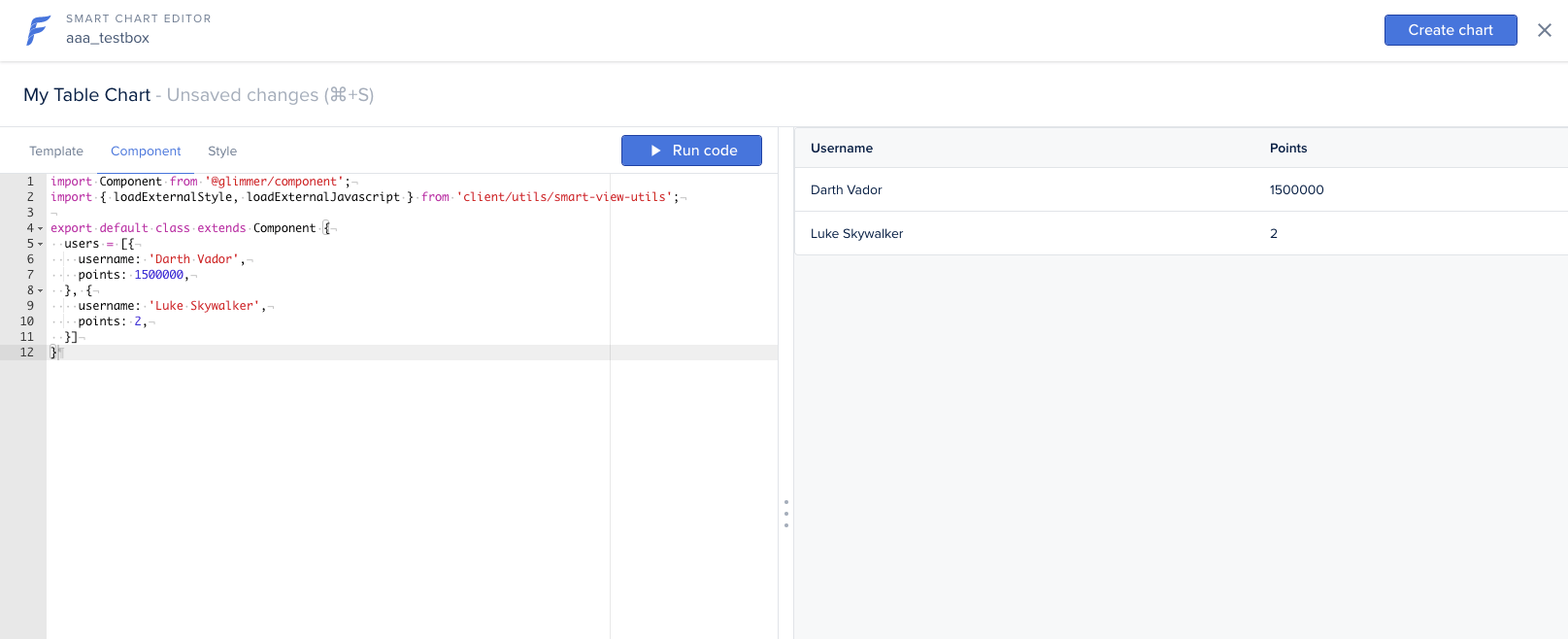
Click Run code at any time to preview the chart. When you’re done, click Create Chart (or Save if already created).
Smart Chart editor with code tabs
When creating a Smart Chart on a specific record (record’s Analytics tab), the record object is directly accessible via this.args.record in the component or @record in the template.

Defining the data source on the back-end

A Smart Chart pulls its data from a custom endpoint you expose on the back-end with addChart. The handler returns any shape your component expects.
agent.addChart('mytablechart', async (context, resultBuilder) => {
  // Load data from anywhere: your database, an external API, etc.
  return resultBuilder.smart([
    { username: 'Darth Vader', points: 1500000 },
    { username: 'Luke Skywalker', points: 2 },
  ]);
});
The component then fetches /forest/_charts/mytablechart and passes the data to the template.

Passing extra parameters

The chart handler’s context exposes any custom query-string or body parameters sent to the chart endpoint via context.parameters, alongside context.caller (the current user). Use them to make a chart depend on a filter, a date range, or the current record:
agent.addChart('example', async (context, resultBuilder) => {
  // Current user
  const { email, timezone } = context.caller;
  // Custom parameters from the request
  const { startDate } = context.parameters;

  const rows = await context.dataSource
    .getCollection('orders')
    .aggregate({}, { operation: 'Count' });

  return resultBuilder.value(rows[0]?.value ?? 0);
});
For collection charts, context also exposes context.recordId, context.compositeRecordId, and context.getRecord(fields).

Example: table chart

A minimal table chart in three steps: back-end endpoint, component fetch, template.
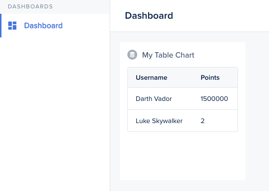
Smart Chart rendered as a table
Component:
import Component from '@glimmer/component';
import { inject as service } from '@ember/service';
import { tracked } from '@glimmer/tracking';

export default class extends Component {
  @service lianaServerFetch;
  @tracked users;

  constructor(...args) {
    super(...args);
    this.fetchData();
  }

  async fetchData() {
    const response = await this.lianaServerFetch.fetch(
      '/forest/_charts/mytablechart',
      {},
    );
    this.users = await response.json();
  }
}
Template:
<BetaTable
  @columns={{array 'Username' 'Points'}}
  @rows={{this.users}}
  @alignColumnLeft={{true}}
  as |RowColumn user|
>
  <RowColumn>
    <span>{{user.username}}</span>
  </RowColumn>
  <RowColumn>
    <span>{{user.points}}</span>
  </RowColumn>
</BetaTable>

Example: bar chart with D3.js

Smart Charts can load any external library. This bar chart uses D3.js, inspired by this example.
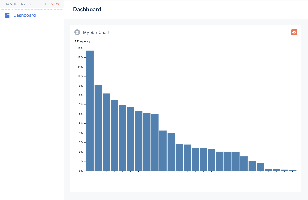
Smart Chart rendered as a D3 bar chart
Back-end:
agent.addChart('alphabetfrequency', async (context, resultBuilder) => {
  return resultBuilder.smart([
    { name: 'E', value: 0.12702 },
    { name: 'T', value: 0.09056 },
    { name: 'A', value: 0.08167 },
    // ...
  ]);
});
Component (excerpt):
import Component from '@glimmer/component';
import { loadExternalJavascript } from 'client/utils/smart-view-utils';
import { tracked } from '@glimmer/tracking';
import { inject as service } from '@ember/service';

export default class extends Component {
  @service lianaServerFetch;
  @tracked chart;

  async load() {
    await loadExternalJavascript('https://d3js.org/d3.v6.min.js');
    const response = await this.lianaServerFetch.fetch(
      '/forest/_charts/alphabetfrequency',
      {},
    );
    const alphabet = await response.json();
    this.renderChart(alphabet);
  }

  renderChart(alphabet) {
    // d3 rendering logic: produce an SVG node
    this.chart = svg.node();
  }
}
Template:
<div class='c-smart-view'>{{this.chart}}</div>

Example: cohort retention chart

A retention table with shaded cells, also using D3.js.
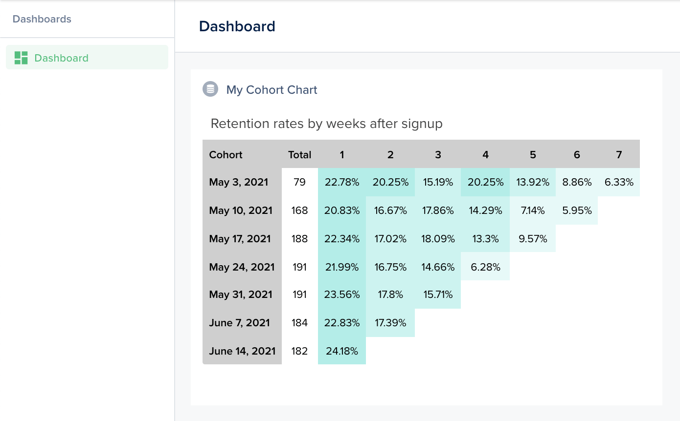
Cohort retention chart with shaded cells
The back-end returns the cohort matrix; the component computes percentages and renders shaded cells; the template wraps the result.
agent.addChart('cohort', async (context, resultBuilder) => {
  return resultBuilder.smart({
    title: 'Retention rates by weeks after signup',
    head: ['Cohort', 'New users', '1', '2', '3', '4', '5', '6', '7'],
    data: {
      'May 3, 2021': [79, 18, 16, 12, 16, 11, 7, 5],
      'May 10, 2021': [168, 35, 28, 30, 24, 12, 10],
      'May 17, 2021': [188, 42, 32, 34, 25, 18],
      'May 24, 2021': [191, 42, 32, 28, 12],
      'May 31, 2021': [191, 45, 34, 30],
      'June 7, 2021': [184, 42, 32],
      'June 14, 2021': [182, 44],
    },
  });
});

Example: density map

A geographic density map, fetching contour data and population statistics, rendering with D3 + topojson.
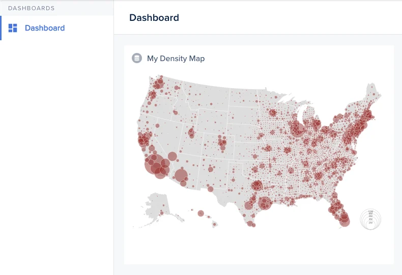
US density map showing population concentrations
agent.addChart('densitymap', async (context, resultBuilder) => {
  const contours = await fetch('https://example.com/counties-albers-10m.json').then(r => r.json());
  const population = await fetch('https://example.com/population.json').then(r => r.json());
  return resultBuilder.smart({ contours, population });
});
The component loads D3, topojson, then renders the SVG. See this Observable notebook for the rendering logic.